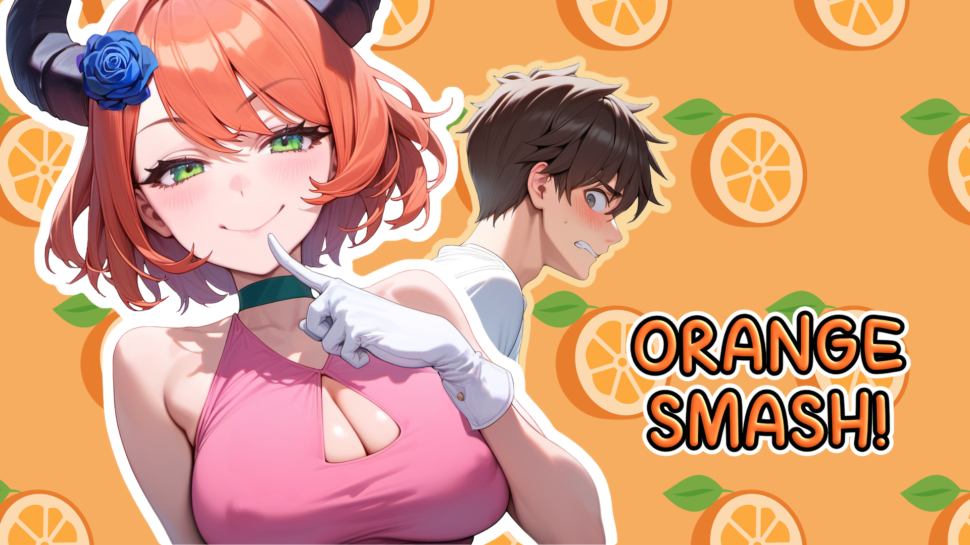
Orange Smash!
Color management is annoying... 🎨
Hello everyone!
Hope you had a great week! 😊
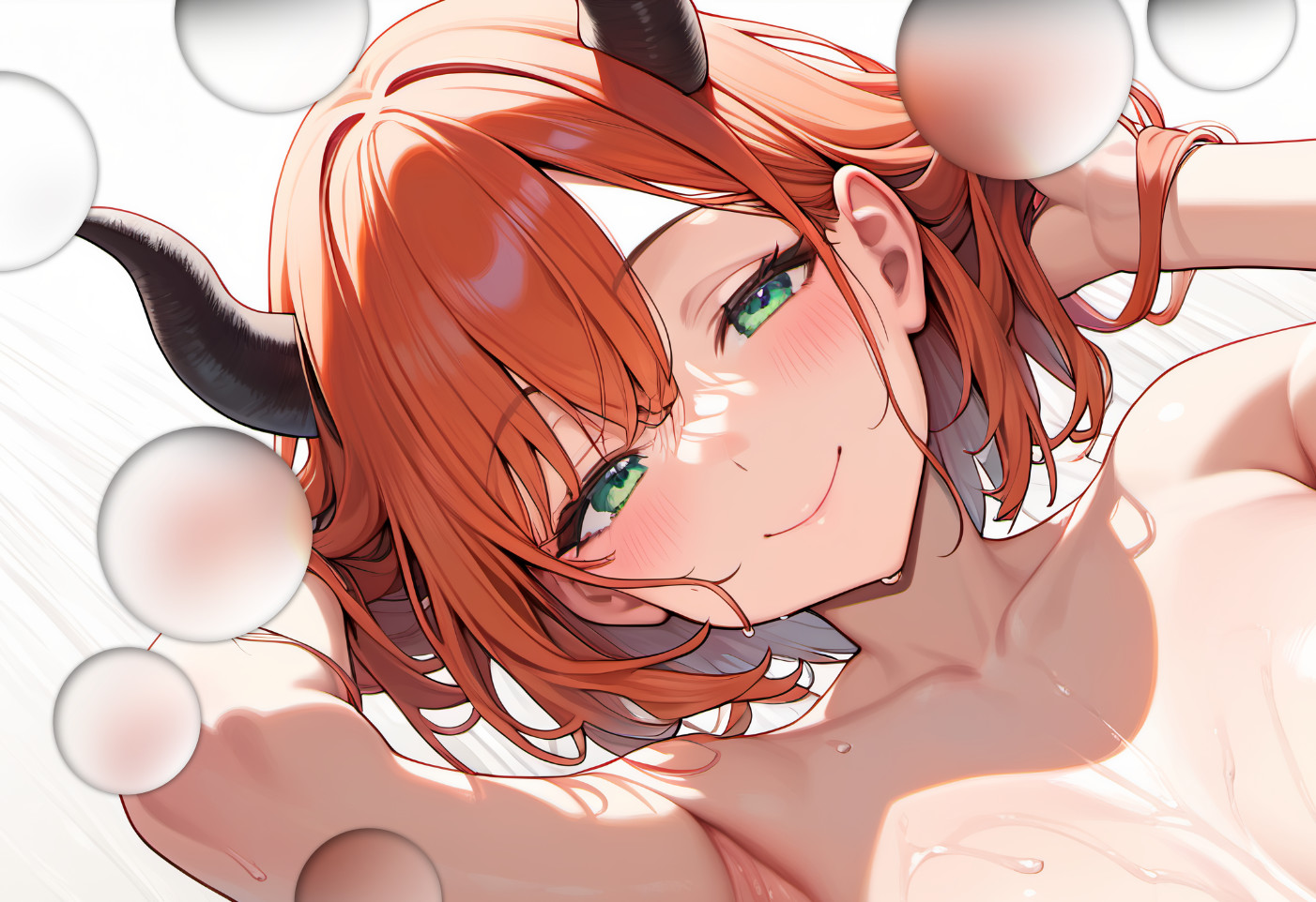
W-What?! You're saying I'm using those glass pebble things in the image just to hide the hands that the AI model f***ed up?! T-that's not true at all!
My week
In the beginning of the week, I finally took some time to figure out the color management "rules" of Affinity Photo, so to speak.
In case you don't know, Affinity Photo is the main image editing program I use. It's kind of like Photoshop, but without the subscription, and of course also not as function-rich as Photoshop (better in some, but not all aspects than GIMP though, imho).
Anyway, so in Affinity Photo, the colors for the images looked pretty different than how they look in Ren'Py. The reason is basically because I bought a monitor with high color-accuracy last year, and the monitor comes with it's own color profile - and this somehow caused Affinity Photo to display the colors wrong.
I've ignored this problem for quite a while, because at least after exporting, the colors were correct, but of course, that's not a real solution.
Long story short, after some help from the Affinity forum, now I found some settings with which now the colors are displayed the way I expect them to! Annoying stuff, but at least it's sorted out now 😊
Other than that, I've been still working on the image set from last week.
While it's still not finished, at least the base is now done, which was the hardest part! 😤
Plans for next week
I'm gonna continue with finalizing that image set.
It's going to be a mix of writing the dialogue for the corresponding scene and making some more versions of that image set to match the dialogue. Probably going to post a sneak peak of that image set on Patreon 👀
That's all from me this week!
Have a great day, and see you next week! 😊
Leave a comment
Log in with itch.io to leave a comment.